Manna Moments

Manna Moments is a women owned wellness brand that creates conversation decks designed to spark connection, emotional honesty, and simple rituals for everyday life. The founder, a licensed therapist, envisioned a product that would help people slow down, soften, and enter conversations that feel nourishing and meaningful.
I partnered with her to bring that vision to life through a brand identity that feels warm, expressive, and deeply human. The system needed to honor the emotional depth of the prompts while staying colorful, joyful, and inviting. The result is a visual world inspired by nature, grounded in symbolism, and flexible enough to grow as new themes and artistic collaboration unfold.
DELIVERABLES
Visual identity system / packaging design / website / foundational brand voice
TOOLS
Figma, Adobe Illustrator, Framer
YEAR
2025
CLIENT
Manna Moments
Brand Voice
Manna Moments speaks in a calm, grounded voice that guides people through reflection and gentle healing. It helps people feel seen and reminds them they already carry the wisdom they need. Our language is simple, honest, and nurturing, offering space for presence and connection.
"Created to invite life's most honest questions."
Voice Principles
Calm and grounded
Simple and honest
Creates emotional safety
Encourages reflection and presence
Visual Direction
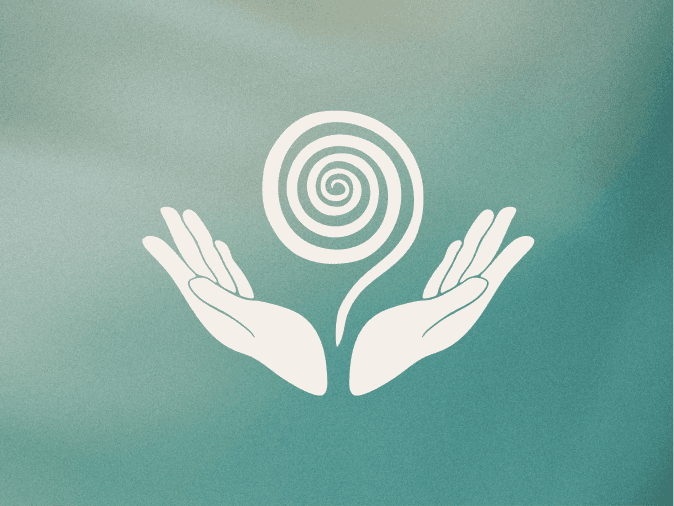
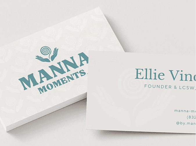
The visual identity blends calm presence with color, symbol, and texture drawn from the natural world. Water, sunlight, and earth guide the palette, offering a sense of steadiness while still feeling full of life. At the center of the system is the logo, two open hands holding a spiral. The spiral reflects the inward journey, the way growth unfolds in gentle layers, and the movement from the outer world into deeper awareness. The hands hold space for that process. Together, these elements create a brand that feels honest, inviting, and grounded in the belief that reflection can bring us closer to ourselves and to each other.
Visual Identity System
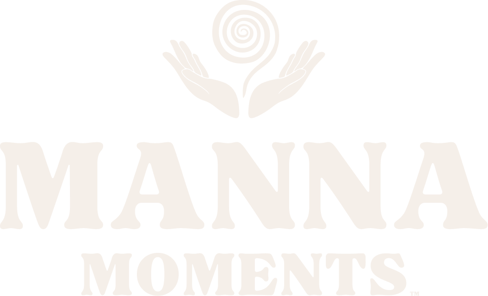
Primary logo symbolizing openness, growth, and the journey inward.


A flexible family of marks used across packaging and digital applications.
A nature inspired palette reflecting water, earth, sunlight, and warmth. Colorful enough to evoke emotion, calm enough to support reflection.
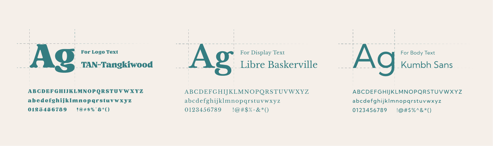
Libre Baskerville brings a grounded, steady presence. Kumbh Sans keeps everything clear and approachable. TAN Tangkiwood adds character through the logo. Together they create balance and ease.
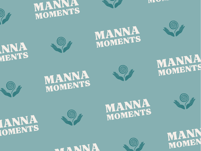
Organic shapes, soft florals, and a brand pattern that expands the quiet, natural rhythm of the identity.
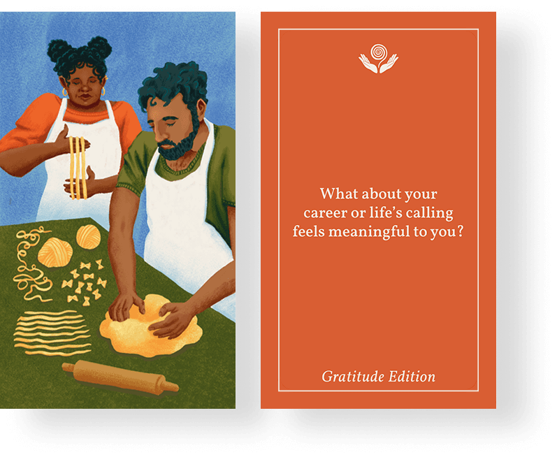
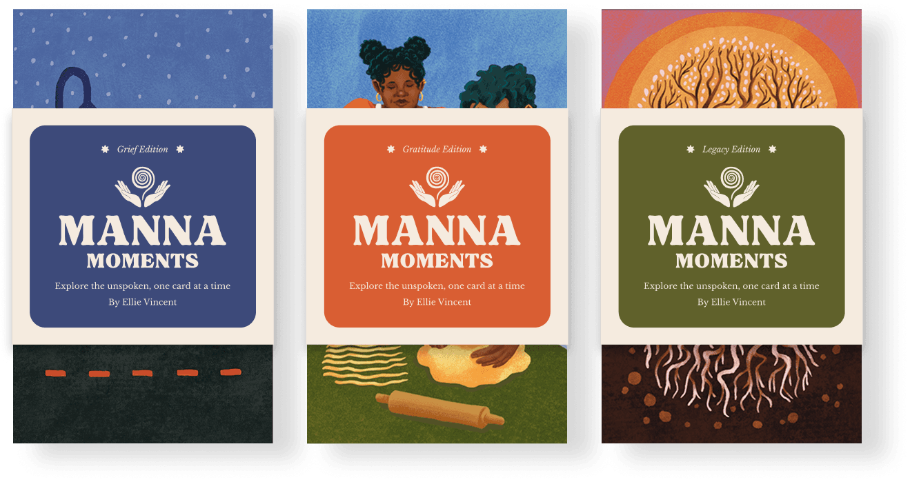
Packaging Design
The packaging was designed to feel simple, warm, and expressive. The belly band format keeps the decks approachable and gift ready while allowing the featured artists’ illustrations to stay visible underneath. Clear hierarchy and gentle color choices create a meaningful first impression without overwhelming the artwork or the experience inside.